Honduras.com
UX · UI · Branding
Client: Honduras.com
Role: UX/UI designer
Year: 2021
Background
🇭🇳 You can visit the live website: here
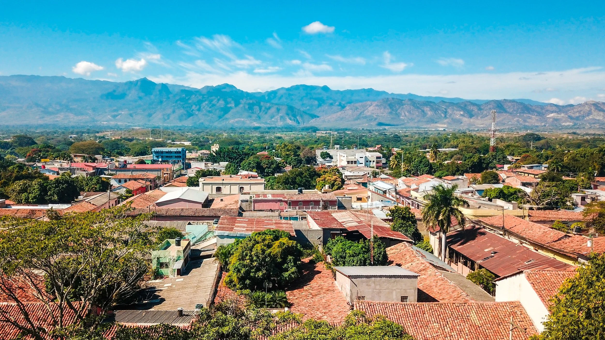
Honduras.com is a pro-country project, just like Guatemala.com. They create positive content that seek to impact every Honduran citizen; highlighting their culture, traditions, values, triumphs, among others. It aims to honor and celebrate Honduras.
Overview
My role consisted in developing the branding identity and to design and handoff both website and app. Both systems and branding identity were meant to be based on Guatemala.com’s structure. For this project I had total creative control for defining the visual assets, which is something I enjoy so much! It is a guarantee that I will have so much fun creating!
Understanding the problem
Even though Honduras.com was meant to follow certain branding and tone of voice based on Guatemala.com, it lacked a visual identity and style guides that can be applied into their app and website; and even power point templates. Also, the logo was already created by someone else, but needed some enhancement for web.
Process
When it comes to research, I asked my family for help. See, my uncle, aunt and cousins lived in Honduras for around 25+ years, so I asked them questions about food, culture, slang, touristic places. Also recalled the times I went to Tegucigalpa (Honduras’ capital) when I was a kid.
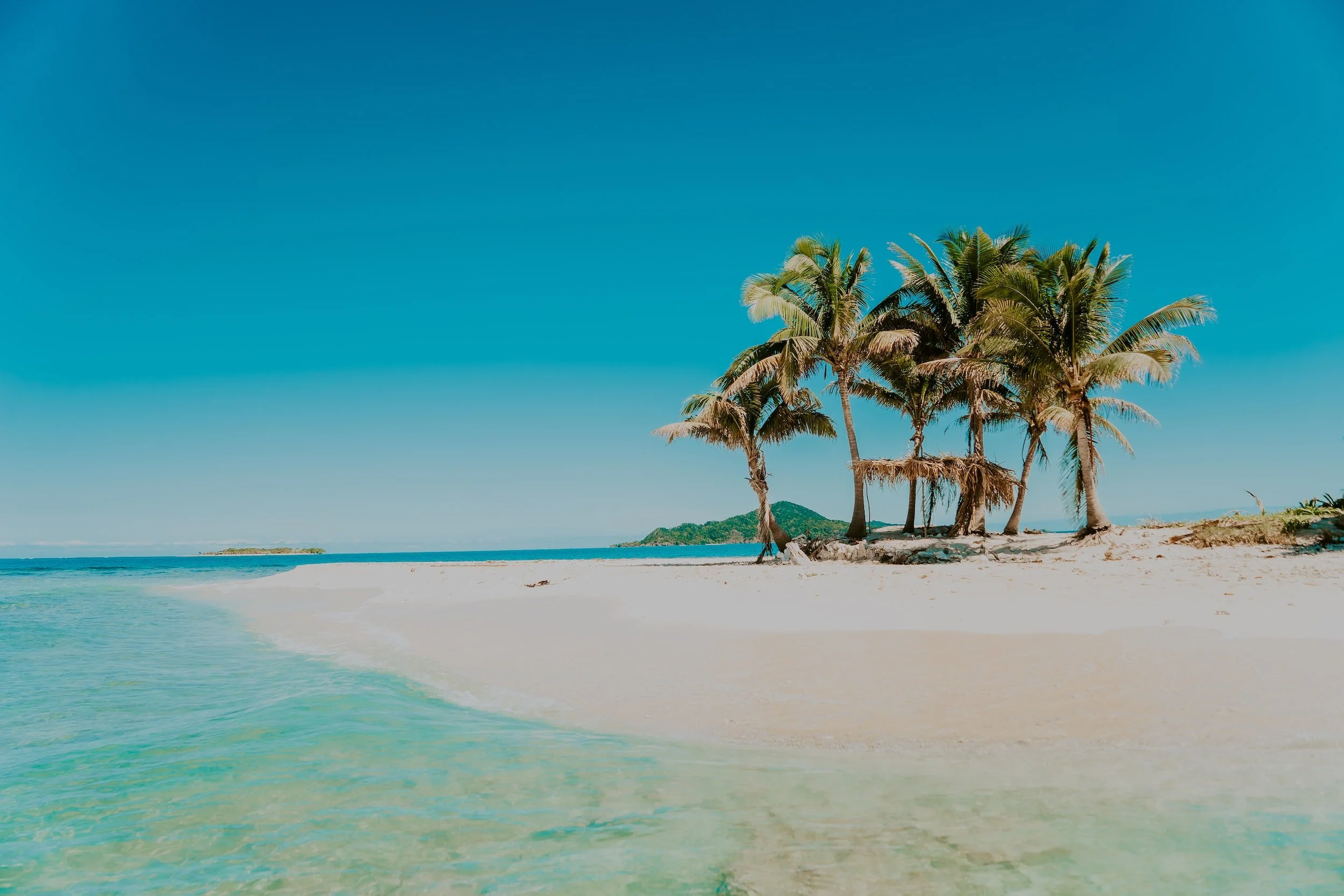
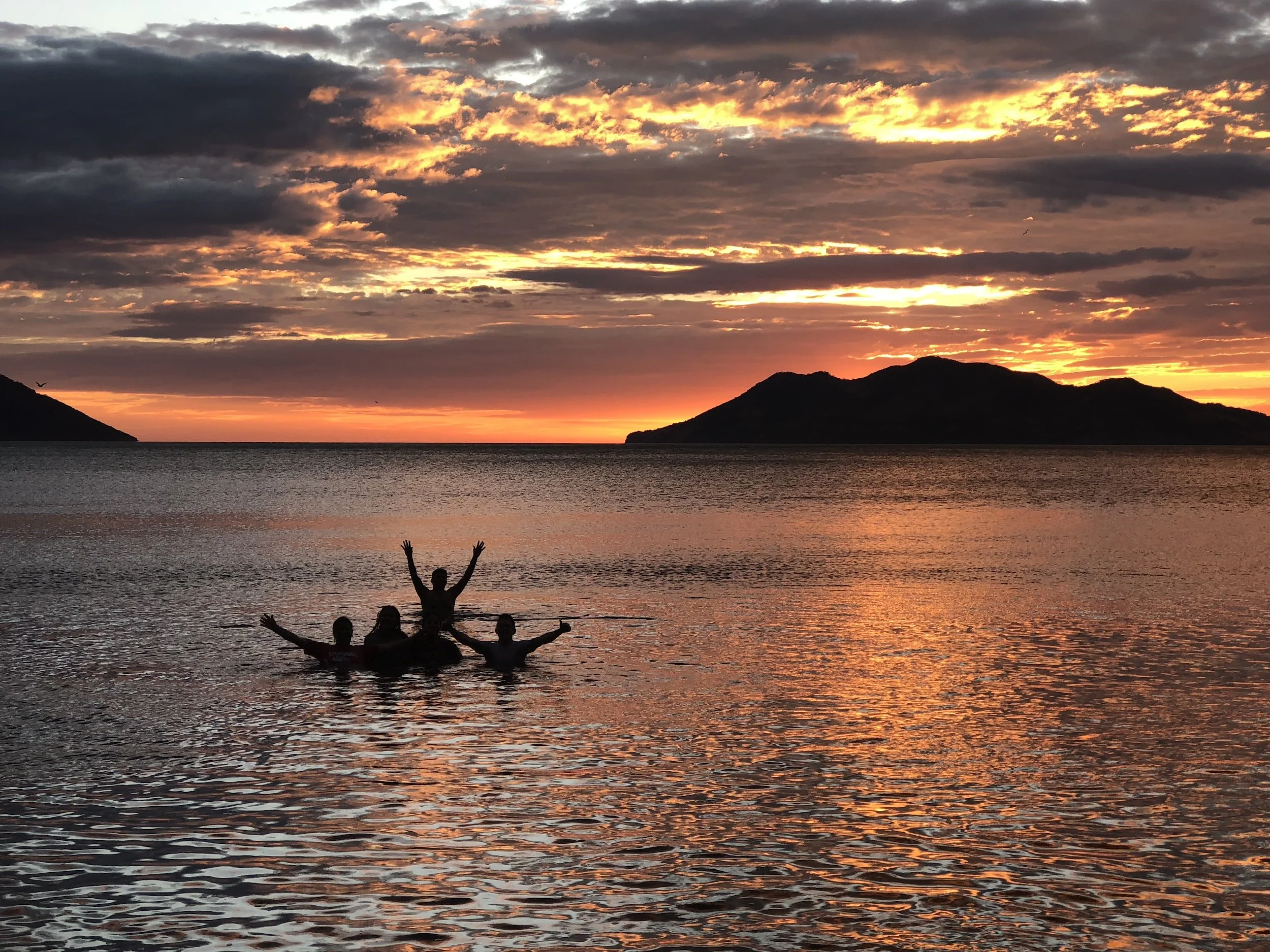
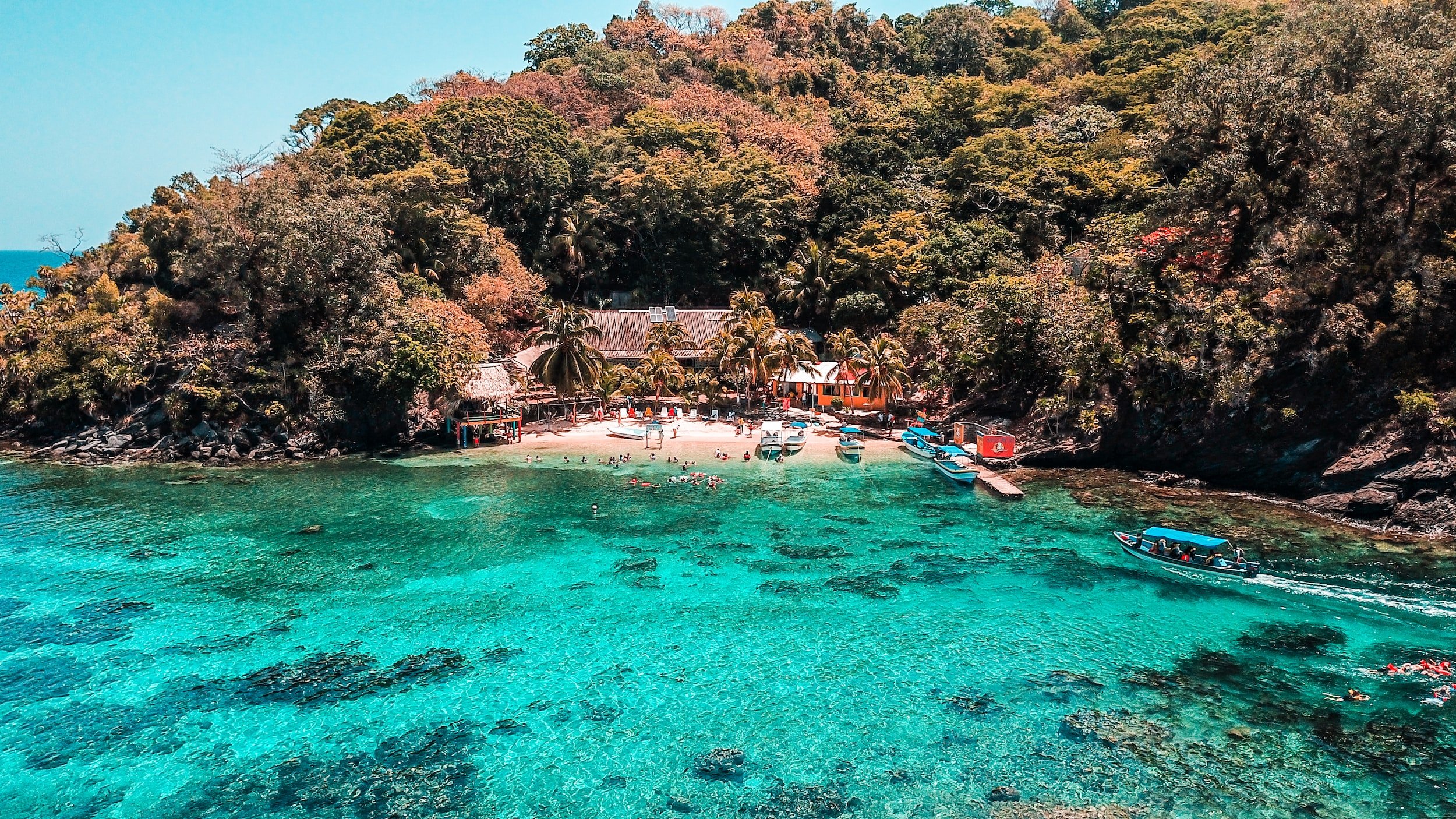
I started the project with the foundations such as color, typography, iconography, photography style, among others. Got a lot of inspiration from Honduras nature and stunning colors! It helped me define a vibrant color palette that screamed Honduras elements such as their coral reef barrier, ruins in Copan, its people, and more!
I was looking for a font family that could function beautifully in a clean way; also it needed to be enhanced for digital media, be Google font, and have various weight ranges. I stumbled upon Lato and it totally made sense to me: it’s friendly, yet functional and also modern. I have a thing for sans serif 💙
Icons are such a big part the site and app. They identify the site’s different sections such as news, entrepreneurship, tourism and so on. Also, each site’s section has a color assigned from the official color palette.
Meet the website
Mobile first! Tap any image to see it up close.
Here comes Desktop
This is the desktop version. Tap any image to see it up close.